top of page
Media A2
Fonts


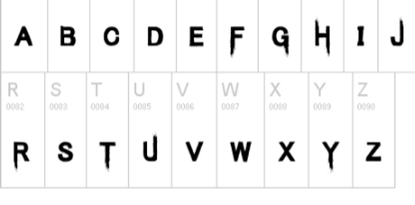

The reasons to why I chose these fonts was because it looks like human flesh being rip off someone’s body. This gave an interesting look towards the poster and films because it really portrays the thriller genre and of the gruesome looks. The colour that I decided on is red, this is because of the connotations that the colour red gives. The colour red connotes blood and danger and that is exactly what we wanted our audience to feel when watching our movie.
bottom of page